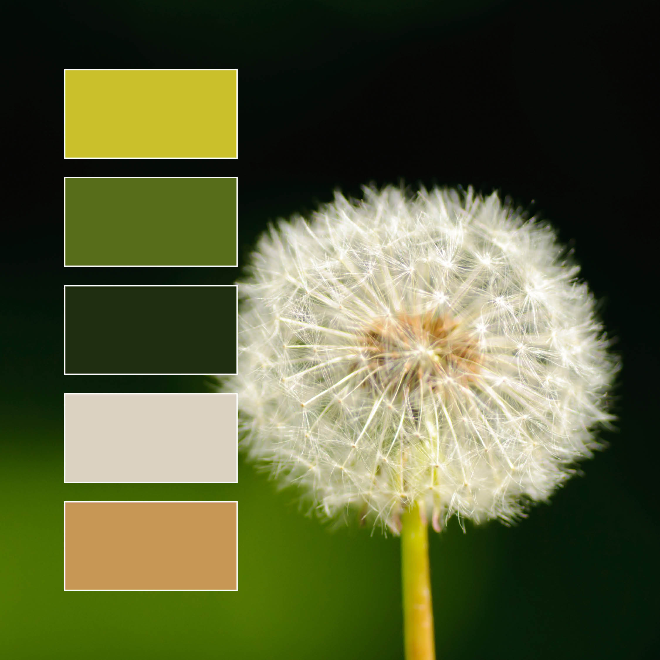
We love this color palette! While its made of mostly greens, a wide variety of shades and hues provides plenty of diversity and interest to the overall image. The bright camel and dusty white create strong contrast with the chosen greens, with each color sharing a subdued quality that highlights the natural harmony of the composition.
While green is on the cool end of the spectrum, its “temperature” is unique due to its status as a secondary color between two primaries; yellow and blue. This means the temperature of a green hue will vary greatly depending on which primary color is stronger.
Greens with more blue than yellow appear “cool”, like aqua or turquoise. Cool greens are typically calming, youthful, and can be used to inspire trust.
Green with more yellow than blue can appear “warmer” than a medium or cool green, like chartreuse or lime. Warm greens are often invigorating, helping inspire creativity and new ideas.
Balanced, medium greens, like those seen in the leafy greens above, function as a resting point for the eye, often pulling viewers in without the stress or urgency inspired by warmer colors like yellow and red. While medium greens can feel like the most “natural” tints and shades, the whole family of greens carries an inherent natural quality, communicating a sense of grounding, harmony, and growth.
Do you have a favorite shade of green?


